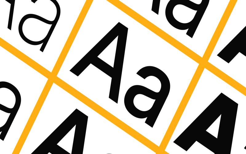
Standing out becomes a prime challenge for content creators and marketers in the vast sea of information that floods our digital world. One of the most powerful tools at their disposal is the judicious use of headline fonts. These fonts, more than mere vessels for conveying written information, play a pivotal role in grabbing attention, setting the tone, and making a memorable impact on the audience. This article explores the significance of headline fonts and offers insights into leveraging them for maximum effect.
The First Impression Counts
Headlines are the gatekeepers of content. Before a reader engages with an article, blog post, or advertisement, the headline is what they encounter first. This initial encounter is critical; it takes only milliseconds for someone to form an impression. Here, headline fonts do the heavy lifting, transforming plain text into an eye-catching, emotion-evoking cue that encourages further reading.
Conveying the Right Tone and Emotion
Fonts carry inherent personality traits. For instance, serif fonts, known for their decorative feet, often evoke a sense of tradition, reliability, and respectability. Sans-serif fonts, in contrast, with their clean lines, project modernity, simplicity, and approachability. Script fonts, mimicking handwriting, add a personal, often luxurious touch. Choosing the right headline font means aligning the font’s personality with the content’s tone, ensuring that the visual message is in harmony with the written one.
The Impact of Size and Weight
Beyond the choice of font type, size, and weight also play crucial roles in headline effectiveness. Larger fonts grab attention faster but must be used judiciously to avoid overwhelming readers. The font’s weight and boldness can emphasize certain words or phrases, guiding the reader’s attention to the most important elements of the headline.
The Psychology Behind Font Choices
The psychology of typography is a field of study that examines how font choices influence perception and behavior. For example, a study might find that readers perceive information presented in a bold, sans-serif font as more truthful and urgent than the same information presented in a delicate script font. Understanding these psychological cues can empower marketers and content creators to choose headline fonts that attract attention and subtly influence how the content is perceived.
The Dynamic Nature of Headline Fonts
Cultural trends and technological advancements continuously shape and redefine which fonts are appealing. What was en vogue a decade ago might look dated today. Moreover, the readability of specific fonts varies across different devices and screen resolutions. Consequently, staying informed about current trends and tech constraints is crucial for selecting headline fonts that resonate with contemporary audiences while ensuring optimal readability.
Tailoring Fonts to Audience and Context
Understanding the audience is critical to effective font selection. A headline font that works well for a teenage lifestyle magazine might not be appropriate for a corporate annual report. Similarly, context matters; the same newspaper might use different headline fonts for its print and online versions to optimize readability and engagement for each medium.
Conclusion
The strategic use of headline fonts is a powerful tool in the arsenal of marketers and content creators. By making informed choices about font type, size, and weight and considering the psychological impact and current trends, it’s possible to craft headlines that captivate, convey the right message, and compel the audience to engage further. As digital content proliferates, the ability to stand out through compelling typography will remain invaluable.

